

As a follow up to yesterday's post, here are two more graphs about the gender wage gap. The first one shows how much men and women between the ages of 25 and 54 earn annually at each percentile of the male and female earnings distribution.
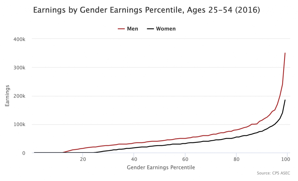
If you hover your cursor over the 50th percentile, you see men earning $41,000 and women earning $25,000. This means the median woman earns 39 percent less than the median man, as reported yesterday. If you move to the left of the graph, you see the bottom 12 percent of men and bottom 24 percent of women have $0 earnings.
The second one plots where each male percentile lines up on the overall earnings distribution and where each female percentile lines up on the overall earnings distribution. I created the same graph for the racial wealth gap last year.
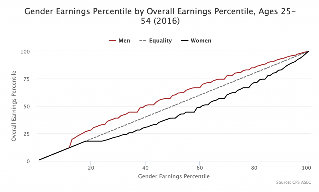
To understand how this works, hover over the 50th percentile. If you do so, you see that the tooltip says "Women: 39" and "Men: 59.8." What this means is that the 50th percentile woman is at the 39th percentile of the overall earnings distribution and the 50th percentile man is at the 59.8th percentile of the overall earnings distribution. If the gender wage gap were eliminated, the black and red lines would converge at the grey Equality line in the middle. As with the first graph, if you move to the left of this graph, you see that below the 13th percentile, there is no wage gap because the bottom 12 percent of men and women have zero earnings.
If you move to the right of the graph, you see the lines converging. This does not mean that the wage gap is smaller in absolute dollars at the top of the distribution. You can see in the first graph that this is not the case. What it means is that they converge in rank order terms. So the 99th percentile woman is not that far behind the 99th percentile man in terms of where she lines up in the overall distribution even if she is far behind in terms of dollars earned.