

Earlier this week, I wrote a post based on the new Census data where I broke down who the poor are and why our system keeps failing them.
A graph from that piece:
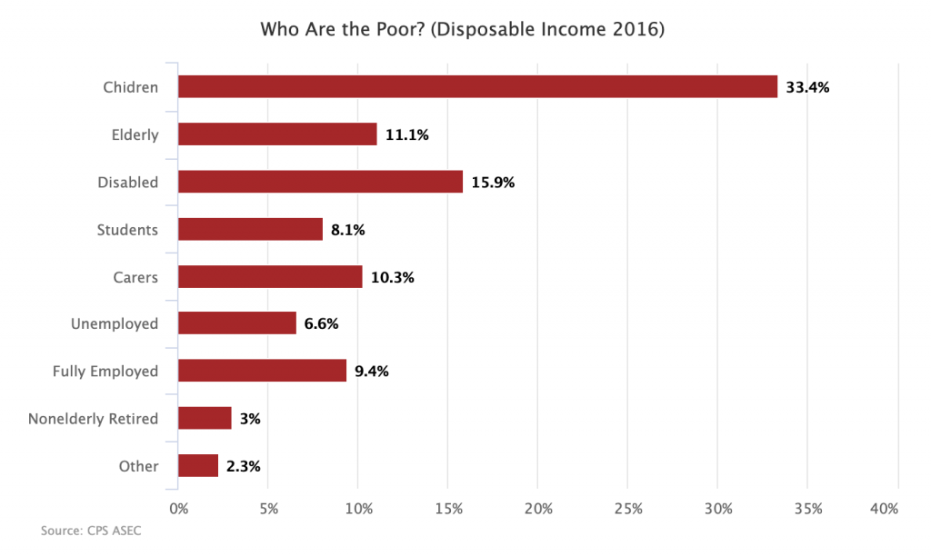
Followed by an explanation:
hildren, elderly, disabled people, and students make up around 70 percent of the poor. If you add in carers and those already fully employed, the number goes to around 90 percent. There is room to activate some of these folks into the labor market, especially carers through the provision of child care and paid leave benefits. But for the most part, the poor are people who cannot and should not work.
The way I produce figures like this is to assign individuals to one of the nine groups based on certain characteristics. Children and elderly are assigned based on age. Disabled people are those who have one of the major disabilities tracked by the Census or who say they had a short-term disability that kept them out of the labor force for some time during the year. Students, carers, unemployed people, and the nonelderly retired are those who say they were out of the labor force for some time for one of those reasons. And so on.
This method of defining who the poor are gets the job done, but it is somewhat imprecise. This is because the nine groups are not discrete but instead overlapping. The presentation makes it seem like a carer is someone who just did caring during the year. But in fact, many did caring for a few months during the year (say after the birth of a child) while working the remainder of the year. The same is true for unemployed people who generally faced some spell of unemployment, but worked as well. And so on.
Given that people move in and out of these statuses during the year, it can be useful to break down how poor and nonpoor people spent each particular week of the year rather than assigning each of them to a single category. Thankfully, the Census data actually allows you to do this, at least for adults.
For the below graph, I have added up all the weeks spent in each status for poor and nonpoor adults in 2016 and then divided by the number of poor and nonpoor adults. This produces a kind of composite poor and nonpoor adult that shows how adults in each group spent their 52 weeks last year, on average.
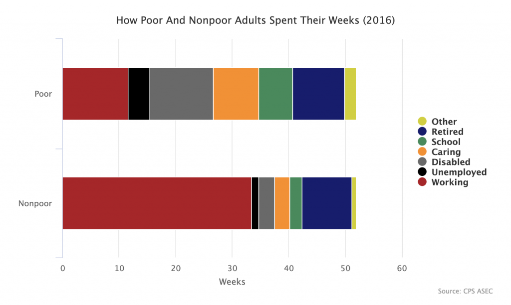
As you can see, the poor tend to spend far fewer of their weeks working and more in a nonwork status, such as unemployed, disabled, studying, or doing unpaid care work. This should come as no surprise because it is finding yourself in one of those statuses that tends to make you poor. This just again drives home the point that if we want to really dramatically drop poverty rates, what we need to do is to build a welfare state that gets income to those in the various nonworking statuses.