

When arguing that the US is much richer than Western Europe or other peer nations, there is one class of people who point to measures of Gross Domestic Product (addressed yesterday) and then another, higher, class of people who point to something called Actual Individual Consumption (AIC). This latter group seems to think that AIC paints a truer picture of the difference between these economies and that this picture is even rosier for the United States. This is also wrong.
What Is AIC?
Officially, AIC is defined as household and non-profit consumption plus government services provided in-kind (e.g. healthcare and education). As a matter of accounting identity, AIC can also be calculated by taking GDP and subtracting from it capital investment, collective government consumption (e.g. police spending), and net exports. The graph below illustrates these two different ways of arriving at AIC in the United States.
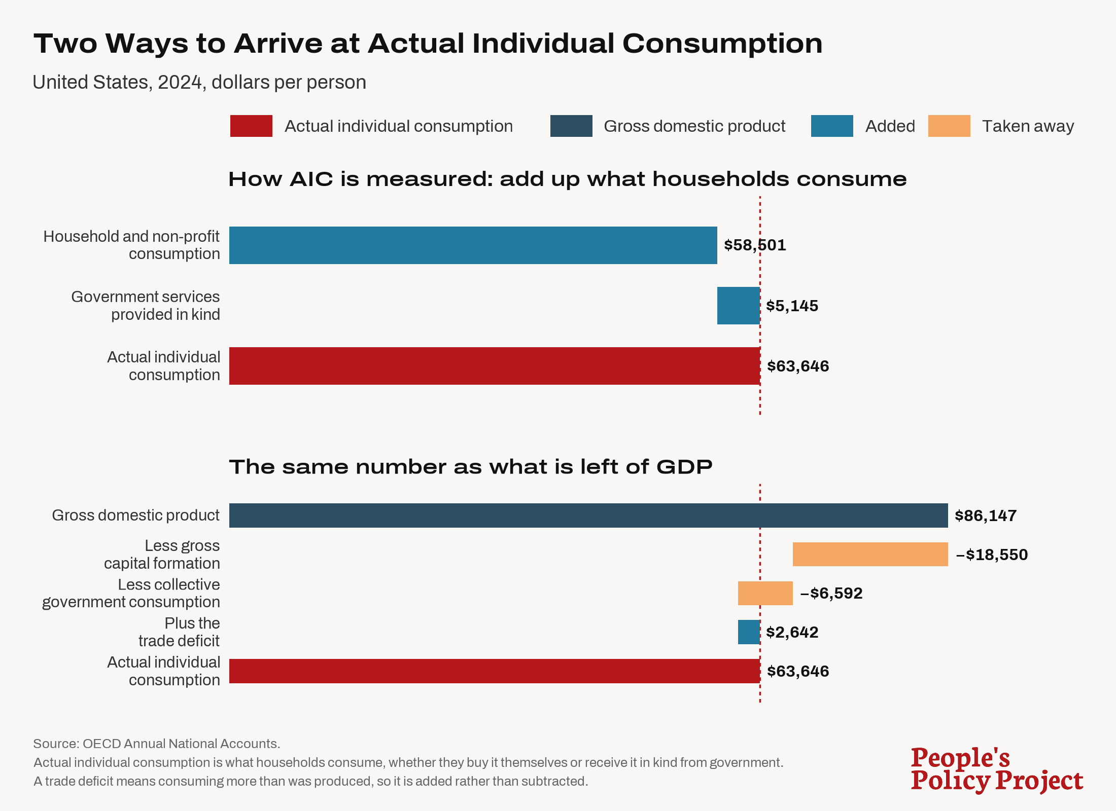
Already, you should probably be wondering whether this is actually a better measure than GDP. As constructed, the best way for a country to excel at AIC, at least in the short term, is to cut capital investment and run up a trade deficit. For a given amount of domestic production, these moves do generate extra household consumption, but not in a way that is necessarily desirable, especially over the long term.
With the exception of the UK, the United States does convert more of its GDP to AIC than other countries. The US has $73.90 of AIC for every $100 of GDP. The same number for Denmark is $58.60. In Germany, it's $66.30.
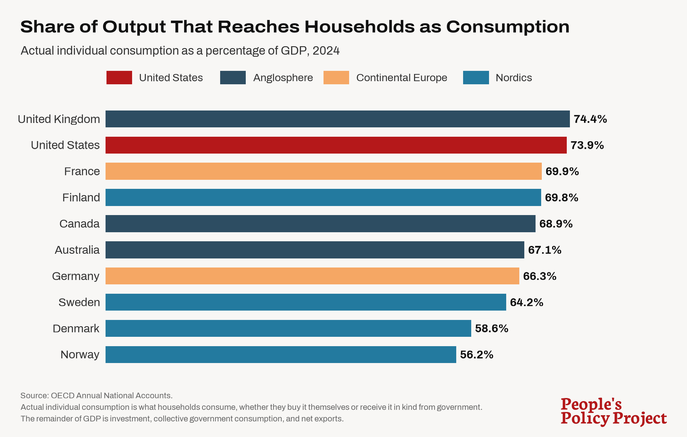
The reason the US has a higher AIC/GDP ratio than its peer nations is almost entirely because the US has a large trade deficit while its peer nations typically have trade surpluses.
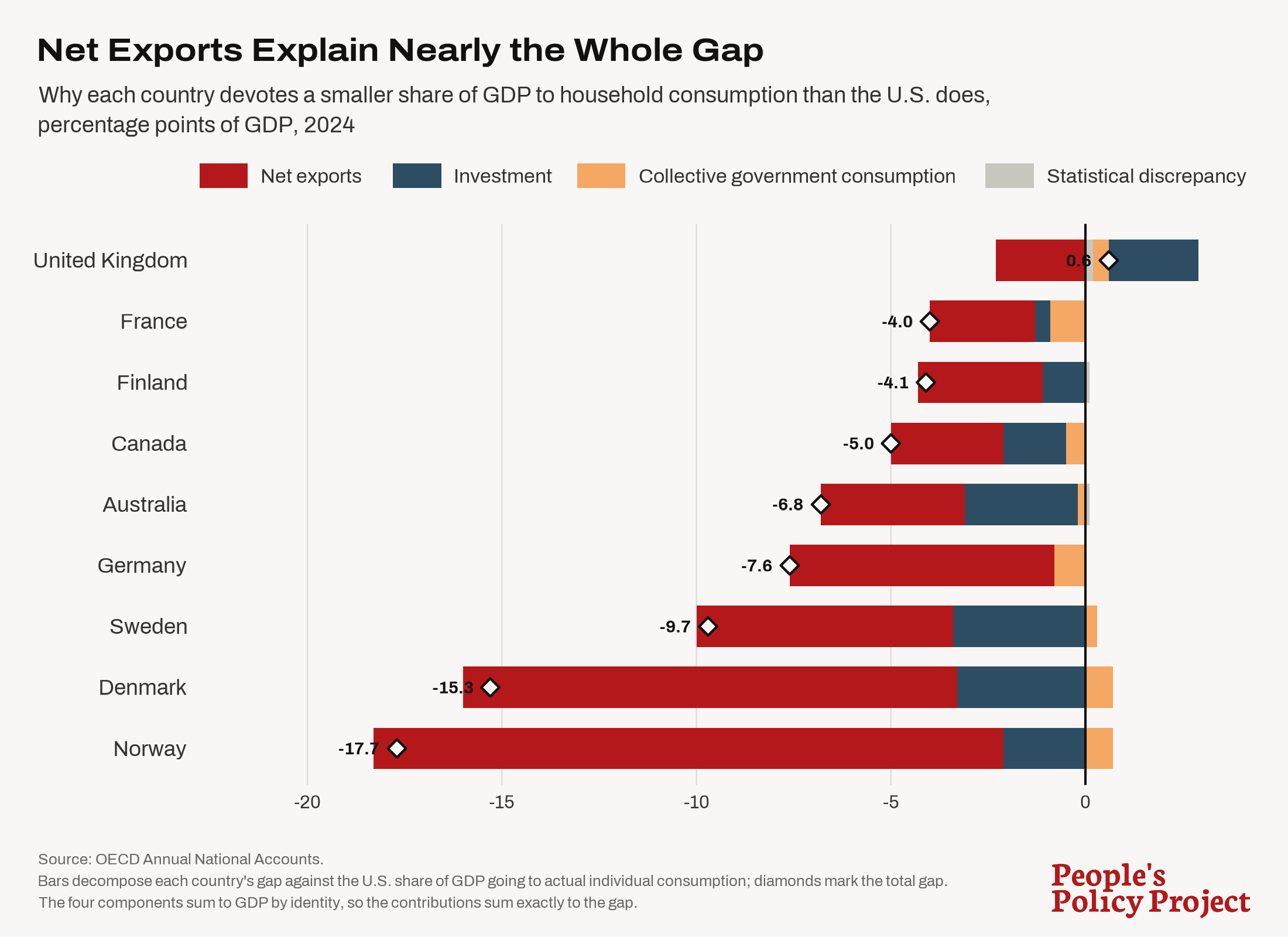
So when someone switches the conversation from GDP measures to AIC measures, all they are really saying is that we should credit the US for importing more than it exports and ding other countries for doing the opposite. What the proper balance of trade ought to be is a worthwhile topic of debate, but covertly burying a pro-deficits position in a discussion about relative economic performance is a pretty silly way to have it.
Non-Health AIC Per Hour
For the reasons stated above, the AIC measures favor the US more than the GDP measures do. One common graphic you see is AIC per capita, which I have reproduced below.
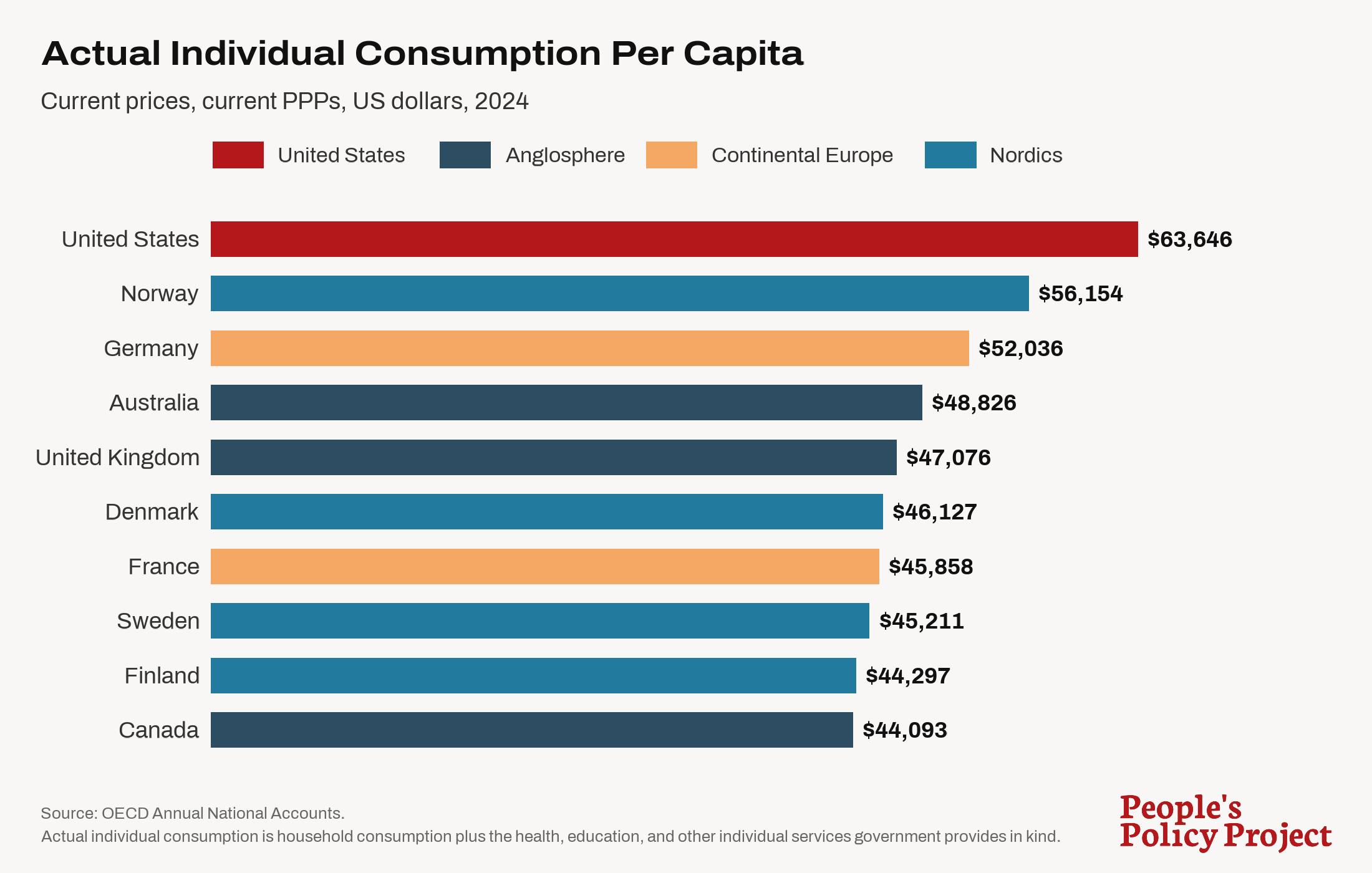
As noted in my post about GDP yesterday, my initial objection to this is that it needs an hours-worked adjustment. Different countries select different labor/leisure tradeoffs, and it is question-begging to rely on measures that implicitly treat non-work time — vacations, holidays, retirement, student life, time with friends and loved ones — as worthless.
When we plot AIC per hour worked, the gaps shrink, but the US still appears to be ahead of the rest except for Norway (for this comparison, it is actually fair to mention Norway because the AIC measures subtract out its huge oil-derived trade surplus).
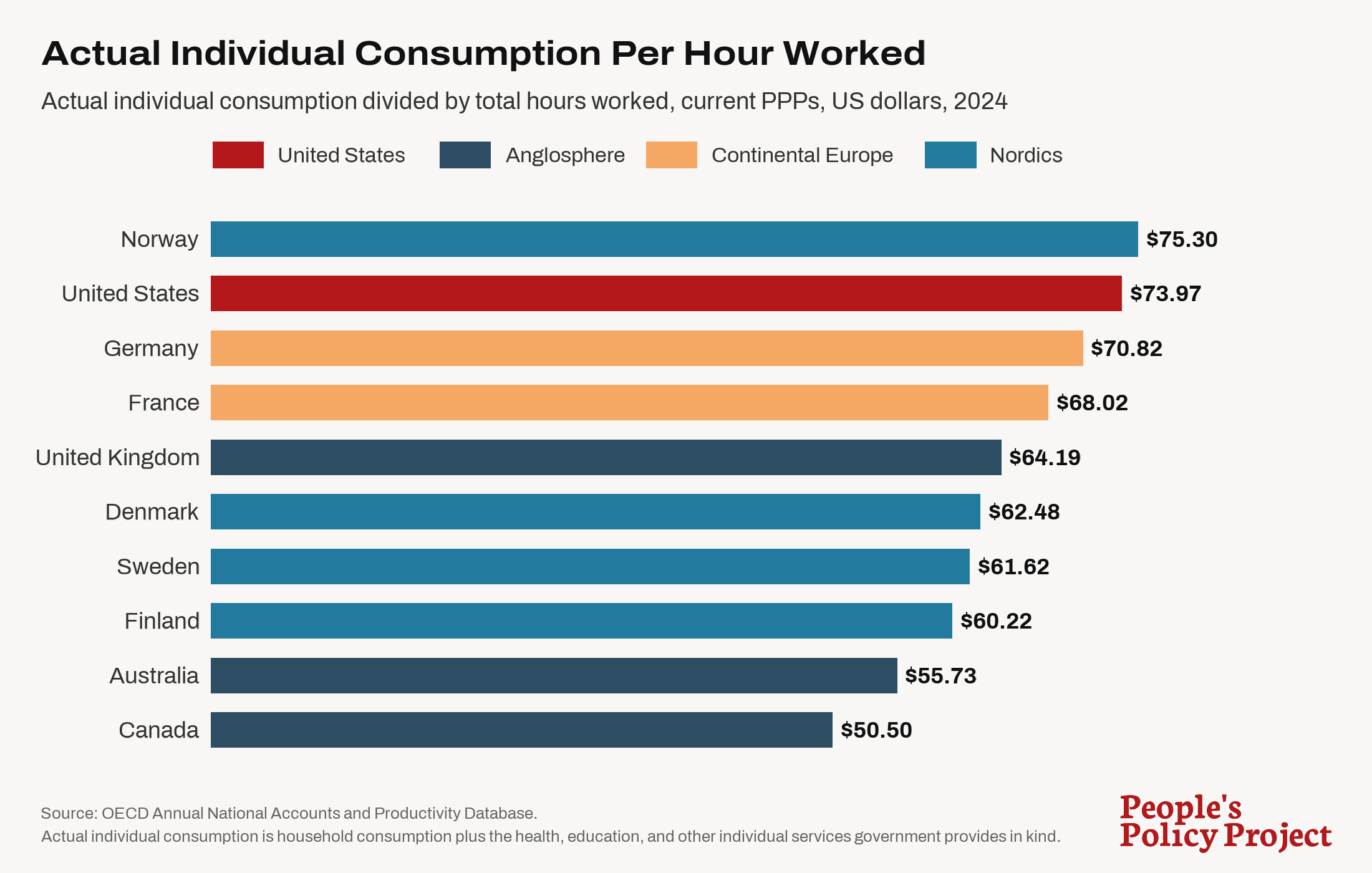
Even after this hours-worked adjustment, this measure still has a glaring problem. One of the defining differences between the US and these other countries is that the US has a wildly expensive and dysfunctional healthcare system while these other nations, all of which have universal healthcare and better health outcomes, do not. The extreme cost of the American healthcare system distorts its AIC figures, vastly overstating actual American consumption.
To see the difference healthcare makes, in this next graph I have calculated each country's AIC excluding healthcare expenditures.
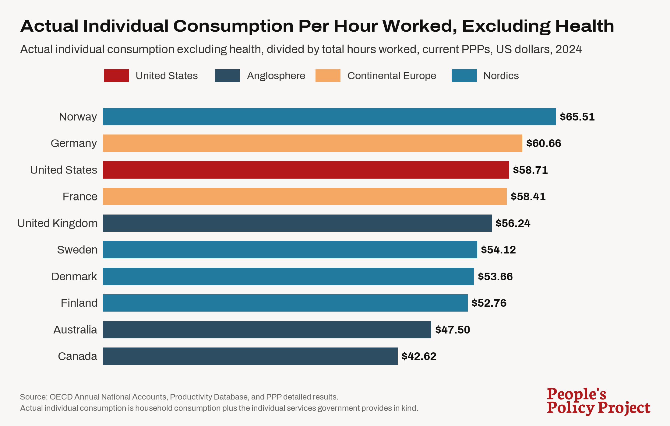
When we look at non-health AIC per hour worked, the US, once again, becomes totally unremarkable. Germany beats the US on this measure while France is only a few cents behind.
Finally, it is always important to remember that these measures do not account for the inequality differences between these countries. AIC is distributed much more evenly in Western Europe than it is in the US. Due to diminishing marginal utility, this means that Western Europe gets more utility out of a given unit of consumption than the US does.
So when you put it all together, those pushing AIC are effectively arguing the US is better than its peer nations because:
- It has a big trade deficit.
- It favors labor in the labor/leisure tradeoff.
- It spends a bunch of money on healthcare administration and healthcare provider rents.
- A dollar of consumption for the upper class is as valuable as a dollar of consumption for the lower and middle class.
Perhaps some writers actually believe these things. I don't. And I doubt these other countries find any of this very appealing. Do the French want to work a lot more? Do the Danes want American-style healthcare? Do the Germans want to run up a big trade deficit? If you think they are wrong about those things, then you should at least focus on the actual components of this divide — deficits, less time off, healthcare waste, inequality — and argue for them, not just post AIC graphs that obscure what is actually driving them.
One Last Note On Healthcare Spending
Since I am already on the topic, I want to respond to a piece that has probably been sent to me one hundred times over the years. The piece, which was written pseudonymously, purports to show that US healthcare spending is actually not that anomalous once you compare it to American AIC rather than American GDP. The piece is long, but this is meant to be the big payoff graph.
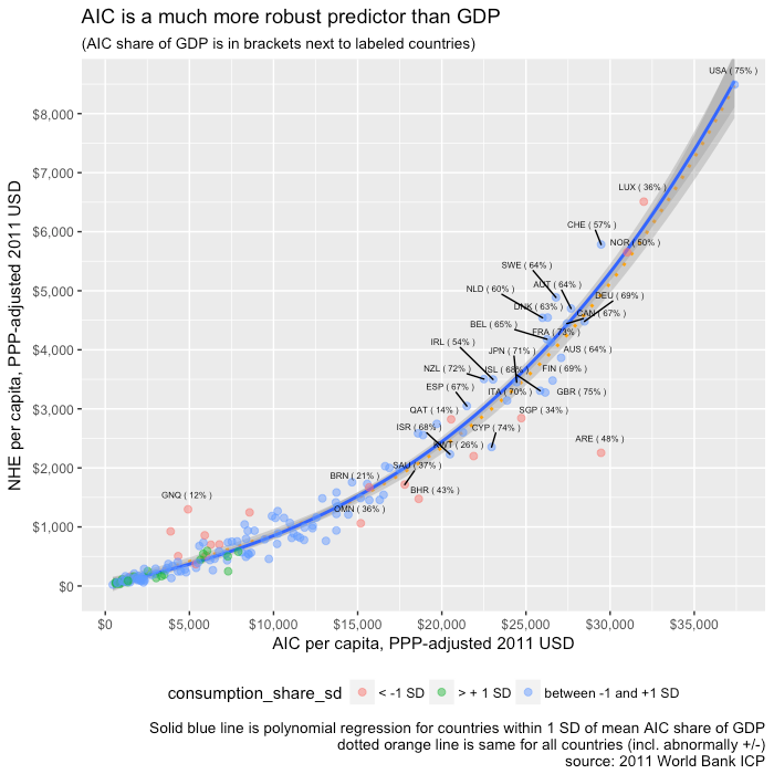
This analysis does not hold up. In the graph below, I plot per-capita health expenditure against AIC per capita for 38 OECD countries in 2023. The US is clearly well above the trend.
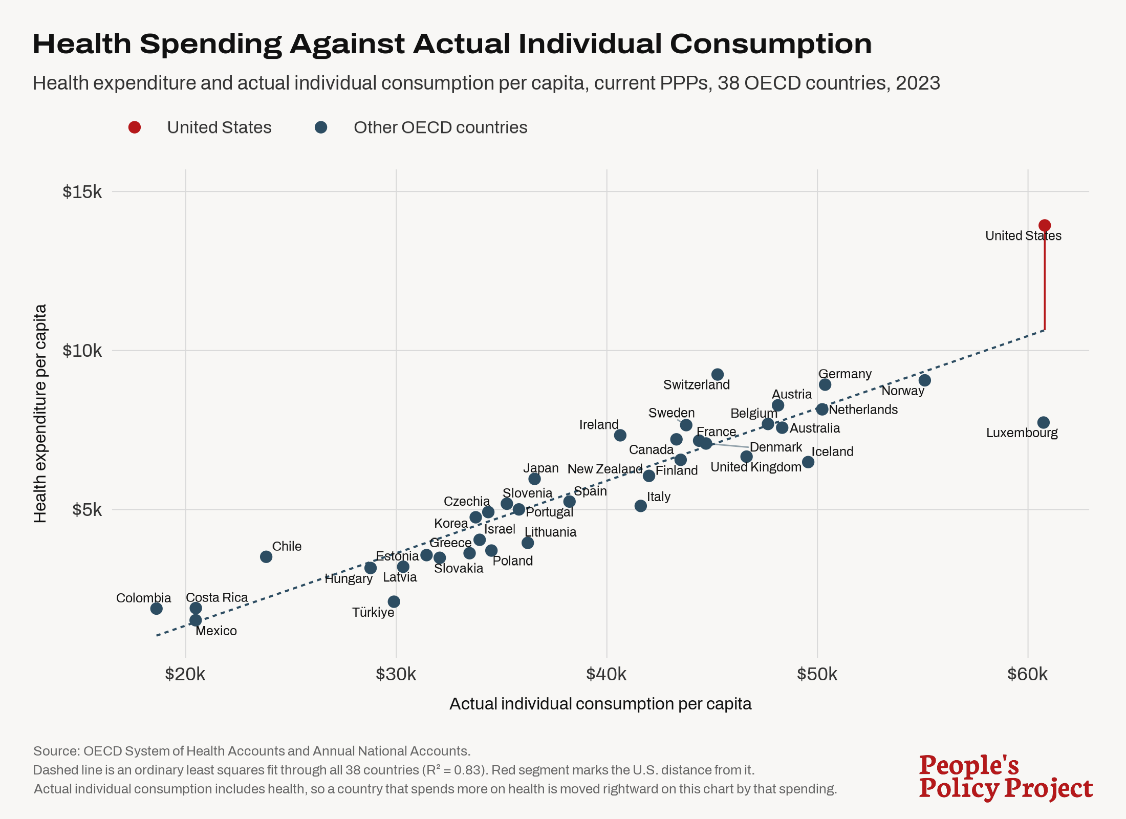
But there is also something a bit circular about this graphic. Healthcare spending is plotted on the vertical axis, but is also contained in the horizontal axis because it is a component of AIC. This means that a country that spends excessively on healthcare sees its dot pushed up but also to the right, understating just how aberrant it really is. So for my final graph, I have plotted per-capita health expenditure against non-health AIC per capita for these same countries.
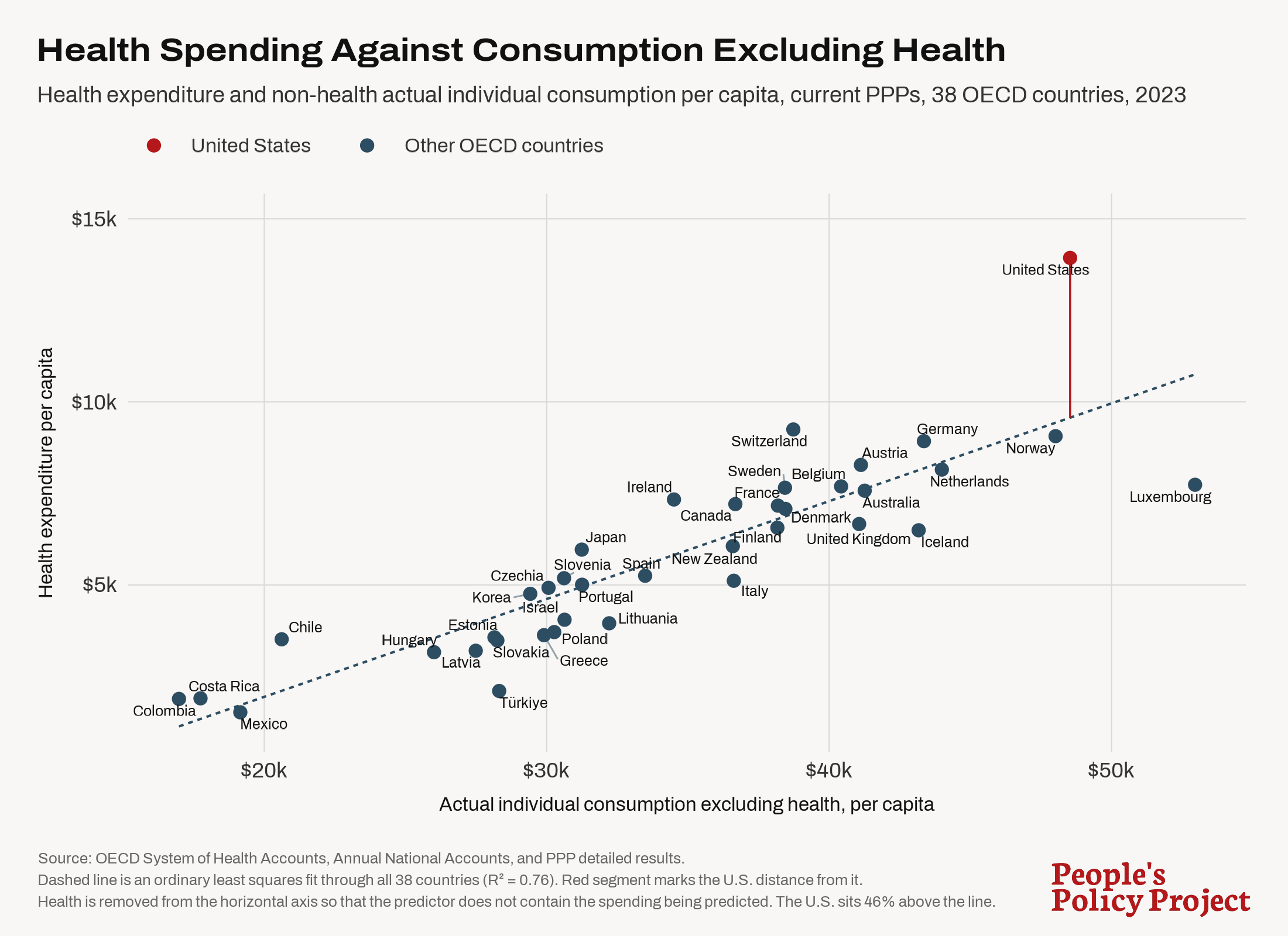
In this graphic, the US sits $4,365 above the trend line. Multiplied across the 2023 American population (336.8 million people), that's $1.47 trillion of excess healthcare spending. If we fit a line without the US (so as to exclude the effect it has on the trend), we find the US sitting $4,872 above that line, which is equal to $1.64 trillion of excess healthcare spending.
As with my piece yesterday, I don't think I am really saying anything particularly groundbreaking here. Americans and Western Europeans have similarly advanced economies and similar levels of hourly productivity. Americans cash out their productivity with more stuff while Europeans cash out theirs with more time. Comparing aggregates between the two generates misleading conclusions because America lights $1.5 trillion on fire each year in its healthcare sector and distributes what remains after doing so much more unequally than Western Europe does.